
Beers Books
Website Redesign

Background
Beers Books has been selling books in Sacramento since 1936. It has had four owners and existed in several locations, making it the oldest bookstore in the city. Beers is a staple of the community, even withstanding the major bookstore boom of the early 2000s.
Beers recently had a location change and moved around the corner because its old building was being demolished to build an apartment complex. It has moved to an up-and-coming area called the Ice Blocks. Beers’ current website has an outdated feel and could use a fresh, modern update to match its new location.
Problem
Beers Books has an outdated website that is lacking in resources and information. They have recently moved locations and are uniquely positioned to appeal to a new audience.
Solution
Redesign the website from the ground up, starting with user research to prioritize users' needs. Apply cohesive branding throughout the site so that it can flow as one. Bring online book sales away from a 3rd party affiliate to increase profits.
My Role
End-to-end UI & UX Designer
Timeline
80 Hours
Tools
Figma, Google Suite, Canva
From This to That


Empathize
Bookstore Breakdown
Key Takeaways
I focused my analysis on two bookstores in Sacramento: a specialized bookstore in San Diego with excellent branding and a well-known large-scale independent bookstore in Portland, Oregon. This nice range of bookstores gave me a broad and detailed look at what goes into bookstore websites today, what works, and what falls short.

Intuitive filter systems make the browsing process fun and exciting, helping to avoid frustrated book buyers
Bookshop.org is a current trend to shop for books through your local bookstore, but it is not the best option for customers or businesses
A well-thought-out navigation system is essential to a smooth book-buying process
Having an engaging staff and social media presence does a lot for small bookstores
In-store events help to bring in new customers and sell books
Curated booklists are trending and a fun way to engage customers
Bookstore blogs are a fading trend
Survey
19 participants
Majority aged 25-34
The vast majority of survey participants were women (17)
The majority of the people who took the survey lived in Sacramento (7), followed by Los Angeles (3)
Most people who took the survey access the internet on their mobile phones 68.4% (13)

How often do you purchase books in person?

How often do you purchase books online?

What is the number 1 reason you would visit a bookstore website?

Please choose the top 3 reasons you would visit a bookstore website.
Key Takeaways
The top 3 reasons users visit a bookstore are to purchase a book, see if they have a specific book in stock, and buy a gift card. With the majority of users purchasing books online, these three reasons should all be well represented on a bookstore website. Most users access the internet from mobile phones, so this project should be approached from a mobile-first and responsive standpoint. While newsletters are not extremely important to users, they can be an effective way of communicating useful information, along with social media. Events are a great way to bring customers in and possibly increase the conversion rate of customers to lifelong customers.
"When it comes to bookstores, it's really all about the vibe for me. If it's good, I'll stay - if it's not, I won't stick around."
Affinity Map
3 participants
Majority aged 30-65
All of the interviewees were women
Conducted two interviews in person, one over the phone, and one via Zoom

Key Takeaways
Users are shopping for books online, and a bookstore needs to have this ability. Bookstore shoppers are busy and want to be able to check the inventory for certain books before they go into a bookstore. It is also important that it is easy for users to find the book they are looking for on the website. A search feature and a filter feature need to be prioritized. The “vibe of the store” was mentioned by 75% of the people who were interviewed. There has to be a good vibe, and it would be even better if this vibe could begin to come across on the website. Users like trinkets and other little things to be available for purchase at bookstores, including bookstore-branded merchandise.
Events are a good way to bring users in and potentially convert users to lifelong customers. Events need to be easy to find and organized for SEO. Every user gets recommendations from family and friends; there could be something here, possibly an easy way to share books or a gift-it option. Recommendations are also coming from social media and podcasts, which could be incorporated.
Define
User Personas
I created two user personas to represent the profiles I developed through my research. I wanted to include both an older and a younger generation to ensure all user needs were covered in the future. I decided to give my user personas a “favorite genre” as this brings a more lifelike quality and as a nod to being an avid reader myself.


Feature Roadmap
This was crucial in the design process for this project. A bookstore website can be a considerable undertaking, as a digital market alone can be vast. I used the roadmap to ensure the minimum viable product to showcase necessary features. As mentioned above, search and filter features must be prioritized.


Sitemap
I designed the sitemap to have a broad main menu as users visit bookstore sites for various reasons, including purchasing a book, seeing if they have a specific book in stock, and buying a gift card. All three of these reasons should be well represented in the site navigation. I wanted the user to be able to find what they are looking for in the most minimal amount of steps possible. I utilized my secondary research to create a navigation that was fresh, intuitive, and in line with current business practices.


User Flows
I created two User Flows that will be pivotal features of the site redesign. The first flow takes a deep dive into how the site will flow when the user visits to find a specific book, this utilizes the search feature. This flow - searching a specific book - is rather straightforward but does allow for error, this is crucial as errors are made regularly. The second flow will emphasize the process a user encounters when they come to the site to browse, this is useful for users trying to pick up a book as well as purchase a book online. The second flow is a bit more complicated, with a lot of alternate paths. I wanted to show how the site design would work to allow for alternate paths.
User goes on website to find a specific book for book club

User goes on website to browse for a book with filters

Task Flows
I created three Task Flows to highlight the search and filter features further. I worked to show the ease with which these features can be utilized. As the most essential features of the redesign, they must be highly accessible. The first will be incredibly common: a user accesses the site to find a specific book. This will likely be the number one path users encounter. The second flow starts to play with the filters; as I have mentioned, the filters will be pretty detailed, and there will be multiple ways to apply them. The second and third flows represent users' paths when using filters.
User wants to search a specific book

User wants to look at books from a specific subcategory

User wants to browse a subcategory with a filter on

Design & Ideate
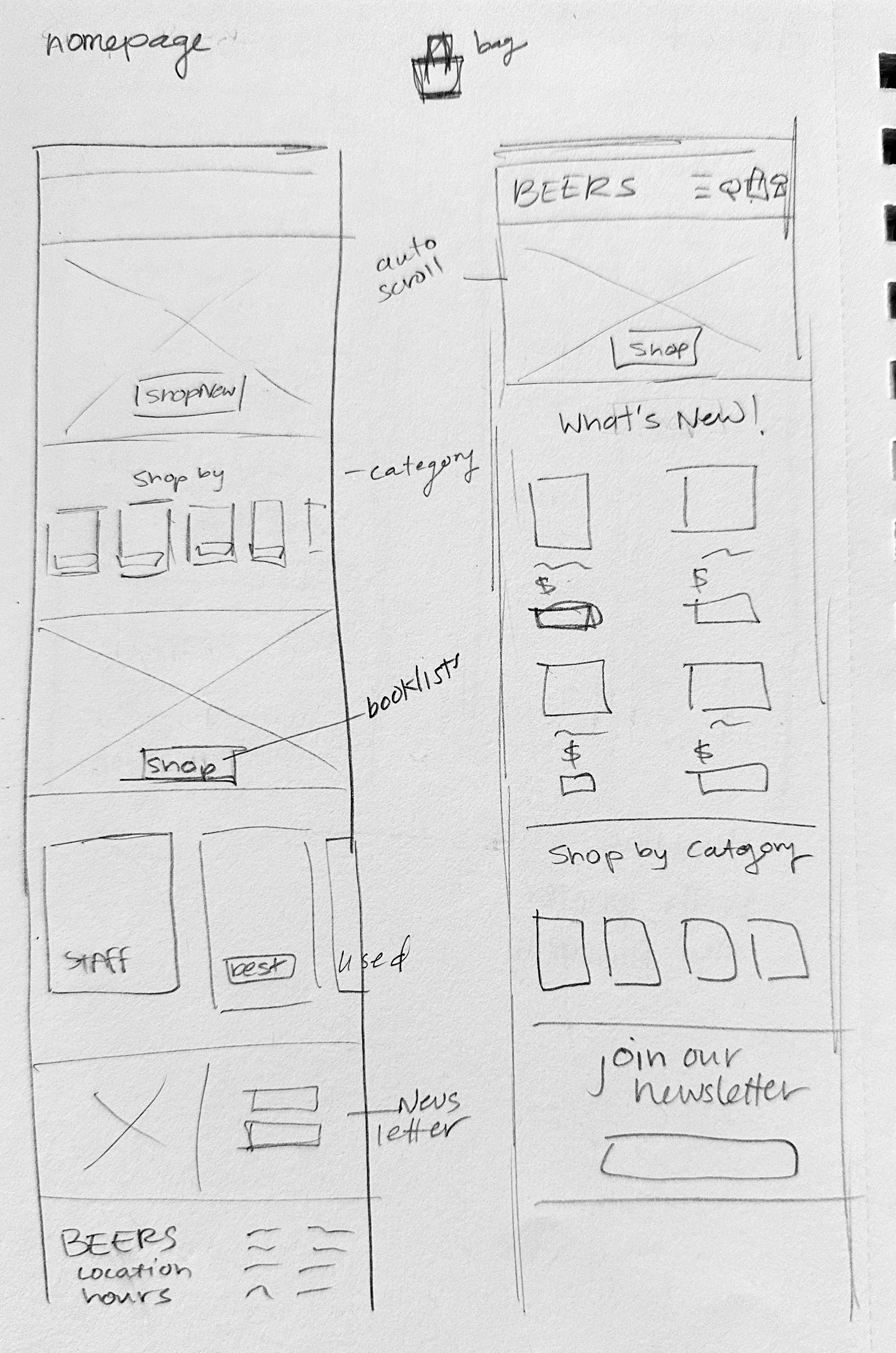
It’s not that Sketchy
I tried sketching as many ideas as possible to see what was working and what wasn’t. I wanted to move away from the current site but keep the bones. The main focus was the homepage, search, and filter features. At this point, I was thinking about as many screens as possible; later, I was able to narrow it down to the most important for the prototype. I worked from a responsive perspective to make sure the site would function on both mobile and desktop. If I had more time, I would love to develop a timeline style “About” page.


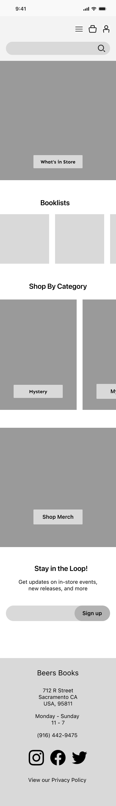
MidFi not SciFi
To take my work from paper to digital, I put my sketches into Figma and worked directly off there. I focused on grids, spacing, and layouts. I worked on the overall look of the filters menu, as this would be crucial to the final product. At this point, I was also highlighting the two separate views the final design would have, grid and detailed. This would allow shoppers to choose between seeing more books per page or more info per book. I included some screens that show more responsive details. Including the filter feature for mobile and desktop, both follow a very similar design with slight changes. For desktops, it will always be present, whereas on mobiles, it will tuck away when not actively in use. I also included the book cards; this is how the books will be presented on both desktop and mobile


UI Kit and Branding
My interviews revealed just how vital the “vibe” of a bookstore is to users, and this left me with a challenge to create branding that presents a good digital vibe before users ever step foot in the store. I wanted to stick with their classic red as it immediately demands the user’s attention, drawing people in at first glance. I used a lot of white and grey to tamp down the excitement. I created a photo treatment to be applied across the board to bring cohesion to the site. I used a mix of Serif and Sans Serif for my typography to emphasize the rich history of classic literature and the ever-changing market of contemporary literature.

Components
The components I created for this project were my best friend and greatest adversary. They allowed me to streamline changes to entire pages with a few short clicks, but I also saw how pesky it can make things down the line. It is fun to see how these pieces came together to create a whole later on. The deep red is eye-catching even on this smaller scale.


High Fidelity
It’s time to put it all together! Using my branding guide, I created a cohesive look across desktops and mobiles. The photo treatment tied the entire site into one. The filter feature was a bit tricky as it needed to be a pop-out on mobile but could exist on the side of the desktop; as mentioned above, this was one of the must-have features on the website, so it was a priority while designing.


Filters Close Up
You can see here that while on desktop, there is no need for a "Filter” button as it is always showing on the left-hand side. When accessing the site on mobile the filters menu will pop out with necessary, this where a user can see exactly which options they have checked.


Product Card Close Up
The Product Cards follow a very similar pattern. My biggest challenge was determining how to include all of the necessary information without making it look too cramped. This was especially difficult for the mobile screens.


“I was listening to them talk about a book, and it sounded amazing so I literally stopped reading and went to buy the book”
Prototype
Missing a Key Screen
As I was creating my prototypes, I realized something was missing. I needed to make a product detail page! I returned to the drawing board and developed a new screen using the same design process. Thankfully, at this point, I already had all of the components and the entire UI kit to allow for a very easy process. This was necessary for the full user flow to be completed.


Flow Number 1

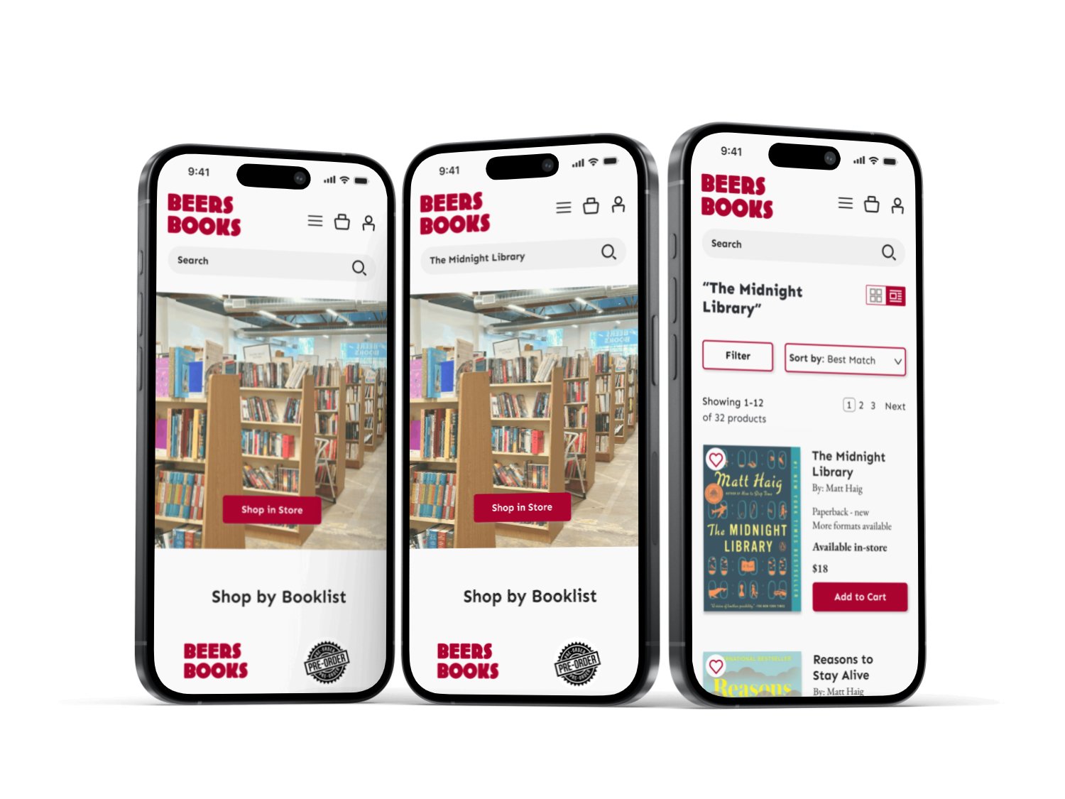
The first flow showed a user's path when searching a specific book. The chosen book to search is “Midnight Library” by Matt Haig. The user can access the search function from almost everywhere on the site, making it very easy to locate. Then, it’s just as simple as typing in the book title. The end goal for this flow was to add “The Midnight Libary” to the cart.
Flow Number 2

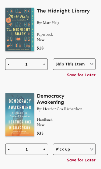
The second flow is designed to highlight the filter function. The user accesses the site from the homepage and then needs to add a few filters in order to see new political releases that are available in-store. This task should be relatively easy to complete as the filter feature was the main focus of the project. The end goal is to arrive at Heather Cox Richardson’s “Democracy Awakening.”

Test & Iterate
Moderated Usability Testing
I conducted four usability tests with participants ranging from ages 25 - 62 remotely through Zoom. This allowed me to have the user share their screen and verbally let me know what they were doing. I could locate the pain points in real-time and ask essential questions.
I noted early on that my first two participants had difficulty locating the “politics” category while filtering by genre. A pain point was located! I decided to update this immediately to see if the following two tests went smoother. I changed “Current Affairs & Politics” to their respective categories.


Key Takeaways
“Politics” needed to be its own sub-category within the filter menu
The search feature is utilized well
“Add to Cart” is used both on the PDP page and the results page
Having 2 “Add to Cart” buttons on the PDP was a bit confusing
Users liked that you could favorite books
Key Changes
Pick up vs. ship changed to a radio button
Checkout page updated to match the overall design better
Politics as its own category (above)


Next Steps
The next step in the process would be to present the updated website to the business and then continue to develop necessary screens. One of the biggest changes I made was to incorporate an online book marketplace directly into their site, this would be a big undertaking as a company and would create new tasks to continue to work on in the future.
Final Thoughts
I was happy with the MVP for this project, I think I captured the vibe of Beers Books. The mobile and desktop screens convert excellently, demonstrating my ability to design using a mobile first approach. I was able to identify early on what features would be most important and demonstrate them in my prototypes.